Mocha Mousse, the 2025 Color of the Year, is a sophisticated and neutral Pantone shade. It is an excellent choice for businesses looking to convey professionalism and warmth. However, neutrals can sometimes feel uninspired if used without intention.
Here’s how you can integrate Mocha Mousse into your business branding, marketing, and design while keeping it dynamic and engaging.
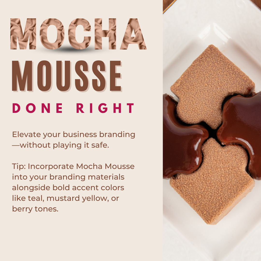
1. Pair It with Bold Accents: Incorporate Mocha Mousse into your branding materials alongside bold accent colors like teal, mustard yellow, or berry tones. For example, use Mocha Mousse as the background color for your business cards or social media graphics and add a bold accent for text or logos to create a striking visual impact.
2. Layer with Textures in Collateral: Use texture to add interest to your business presentations or printed materials. Mocha Mousse can be the base color for embossed business cards, textured stationery, or even matte-finished packaging, making your brand feel premium and tactile.
3. Infuse Patterns Into Marketing Materials: Patterns featuring Mocha Mousse can create a modern, professional feel. Use geometric shapes or subtle patterns in brochures, social media posts, or website backgrounds. This helps draw attention without overpowering your message.
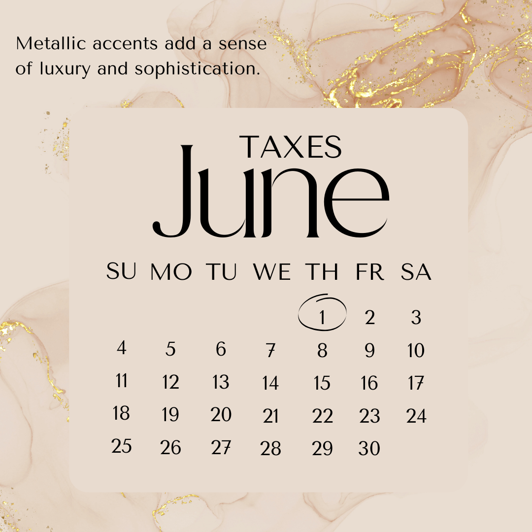
4. Incorporate Metallic Details in Branding: Metallic accents like gold or bronze pair beautifully with Mocha Mousse, adding a sense of luxury and sophistication. Use metallics sparingly in your logo, signage, or product packaging to give your brand an upscale feel.
5. Create a Monochromatic Palette for Brand Consistency: Mocha Mousse works beautifully in a monochromatic color scheme. Use lighter and darker variations of this shade in your marketing materials, uniforms, or office decor to create a cohesive and polished brand identity.
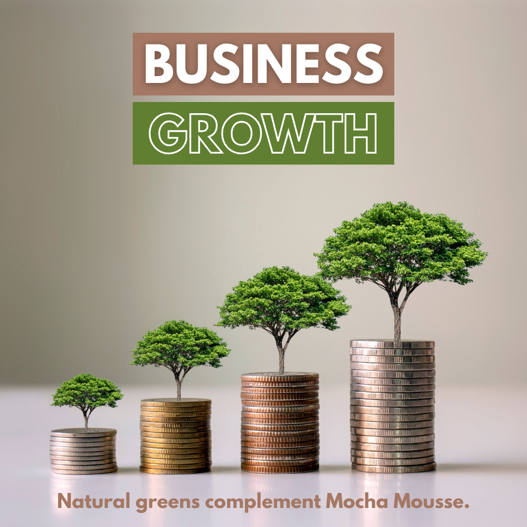
6. Add a Touch of Greenery to Visuals: Natural greens complement Mocha Mousse in business contexts. Incorporate greenery into office spaces, product photos, or promotional graphics to convey growth, sustainability, and a fresh perspective.
Mocha Mousse offers endless possibilities for businesses aiming to project warmth and sophistication. With the right combinations of colors, textures, and accents, you can make this neutral shade work beautifully for your brand.
Keep These Tips
Add these tips to your pinboard or download this infographic for inspiration all year long.
Want more inspiration?
Check out the Pantone post about how to use this deep sophisticated color in your designs.


